post

Top Eleven Tips on How To Sign Your Art

Top Eleven Tips on How To Sign Your Art

Having signed many pieces of art in various mediums and having a strong design sense I feel quite knowledgeable on this subject.

  1. Is it necessary to sign your artwork?  The answer is YES.  Whether you decide to sign the front or the back you should always sign your work.  Several contemporary artist sign the back of their paintings as their signature on the front would interfere with the imagery and integrity of the painting.  If you look at Mark Rothko, Bridget Riley, Ellsworth Kelly, and the later works of Jack Bush, Kenneth Noland, Piet Mondrian you will find their signatures on the back of their paintings.
    Some artists may ask the questions, “wouldn’t be very difficult to market and brand yourself if you don’t have a signature on the front of your art. How will your fans know who you are? How will they be able to look you up?” The nature of the painting should dictate where to sign.
  2. I suggest you refrain from using your customary signature. This not only applies to your artwork but also your website. Identity fraud is very enticing to some people. Cyber thief is a reality.
  3. Let your signature be readable. Let’s face it you want fans and collectors to know who you are. Your signature should be clear and recognizable.
  4. Do you use your maiden name, married name, full name, Initials, logo or surname only? This becomes very personal. If you have a long name you may prefer to shorten it by using only your initials, surname or your first name. Vincent Van Gogh signed his name Vincent. Rembrandt signed his artwork using his first name. Some of his earlier works were signed with an initial “R” and later he used his Monograph “RH” and starting in 1629 he used “RHL”. Leonardo da Vinci (Leonardo di ser Piero da Vinci) signed his works “Leonardo” or “lo, Leonardo” ( “I, Leonardo”). Pablo Picasso signed his name using his surname. If you have been painting before you got married and your fans know you by your maiden name I would suggest keeping consistent so you don’t have to re-market yourself. I would suggest that if you sign the front using only your initials, first name or surname than be sure to sign the back of the artwork using your full name and be sure it is legible.
  5. Be consistent so you become recognizable. It is probably best not to follow into the footsteps of Rembrandt (see tip #4). I never thought I would ever say that. Chuckle, chuckle.
  6. Where should I place the title of my painting?   You may want to add the title on the back.
  7. Where do you place your signature? Generally, artists sign their work on the lower right hand side and sometimes on the bottom left depending on the design. Keep your signature away from the sides and bottom edges. You should be considering how the art is going to be framed so that the signature doesn’t get cropped off by the framing.
  8. What colour do I use to sign my painting? I have seen too many paintings signed using black when there was no black paint in the painting. If you do this, the viewer looks at your signature first as it appears very distracting and awkward. The eye looks for repetition.  It will look for the colour black elsewhere in the painting and it won’t be there. It is best to use a colour that has been used in the painting so it harmonizes. If your artwork is a graphite drawing than I suggest signing your work with graphite staying consistent with the your chosen medium.
  9. How large or small should your signature be? This is a stuff question as some will say the size of your signature should be in proportion to the size of the artwork.  Check out artist Robert Ryman, Untitled, 1958; casein, colored pencil, and charcoal on paper, 9 3/8 × 9 3/8 inches, Whitney Museum of American Art, and you will find that his signature is large and part of his composition.  I like my signature to be noticeable but not so large that I’m saying “Hello here I am”. I don’t want my signature so small that it gets lost so I try to find a happy and reasonable balance.
  10. What tool should you use to sign your artwork. When I sign a pencil drawing I use a pencil. If my art is an ink drawing than I sign using the same tool i.e. a pen. If I’m signing a painting than I use a brush and in my case acrylic paint. I generally take a piece of vine charcoal and print my name so that I can check out my spacing. I don’t like surprises when it comes to my signature. I don’t seem to be able to write my name using a brush and acrylic paint without it looking messy and illegible.
  11. Should you put a date with your signature? It’s a personal choice. You should record the date you created your painting.  You may want to create a catalogue should you ever have a gallery retrospective.  In the future, you may want to publish a book of your artwork, therefore, having a record of your work would be advantageous.  It is always better safe than sorry.  I keep a record of the date, title, medium and size of my all my artwork. There is a debate that if you date the front of your painting it limits its potential to sell. Some say that if a painting is a couple of years old and you are trying to sell it potential buyers may wonder why it hasn’t sold. There is no right or wrong answer here. If you are in the habit of dating your work place the date on the back of the painting. Dating your work records your artistic development.  It gives curators or art historians a guide to it’s historical relevance.

Hope my top eleven tips on how to sign your art has answered most of your questions and has given you more confidence to sign your name.

post

About Colour: Green

About Colour: Green

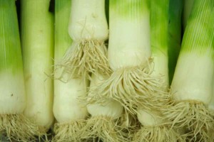
Leeks2Blog

About Green

Green is the colour of the vegetable realm. It represents fruitfulness, prosperity, tranquility, vitality, youth, longevity, harmony, life, balance and the environment. It relates to going forward, and safety. This colour is linked to our traffic light system – “Go”.   When green inclines towards yellow we think of Spring and early Summer bringing forth hope, joy and the buds of new growth. On the other side of the scale its negative meanings are envy, greed, jealousy, immaturity, inexperience, naïve, gullible, ignorance, juvenile, and illness.

Green in Different Cultures

  • In Western culture: Green means Spring, new birth, go, money, St. Patrick’s Day, Christmas combined with red. It also means luck as symbolized by a green shamrock, and eco friendliness. A plot of grassy land, the Green party
  • Ireland: Irish Catholic nationalists
  • Eastern: Eternity, fertility, family, health, prosperity, “clean, and contamination free” and peace
  • Egypt: Green is a sacred color representing hope and joy of Spring
  • China: Green hats imply a man’s wife has been unfaithful (infidelity). In the Ming Dynasty green was the colour of the heavens.
  • India: The colour of Islam, new beginnings, and harvest
  • Native Indians: Of Face paint – nature, harmony and healing and of War Paint – endurance. The Apache tribe considered green to represent one of the four sacred mountains.
  • Indonesia: a forbidden colour
  • North Africa: corruption
  • South America: death

The Theory of Green

  • Green is a secondary colour located midway between the primaries yellow and blue on the colour wheel.  Yellow and blue mixed create green.
  • It’s character of expression changes depending on the ratio of these primaries in the mixture. This ratio will reflect its colour temperature.
  • More yellow makes green lighter and more blue makes green darker.
  • The range of different greens is wide.  There are lime greens (yellow-greens), jade greens, aqua greens, turquoise greens, and emerald greens.
  • A little red and a large area of green will make the red energetic and lively.
  • A little red added to green will dull the green making it less intense descending into a gray-black.  This will happen with any complementary pair.
  • A high percentage of men are genetically red/green colour-blind and have difficulty distinguishing some greens.

A Poem About Green

“What is Green?”

Green is the colour between blue and yellow.
Green is the grass that makes me mellow.
Green is a sign of buds in Summer.
Green is an emerald for a lover.

Green practices are environmentally beneficial.
Green with ivy is superficial.
Green is the colour of Kermit the Frog
Green is not the colour of a sheep dog.

Green is harmony, life and balance.
Green around the gills is a challenge.
Green is the smell of pine needles burning.
Green is a sign of Spring returning.

Author: Donna Wilson

Stay Connected: In future blogs I will discuss more on the topic of colours.  Do check out my website at www.donnawilsonartist.com


post

About Colour: Orange

ABOUT COLOUR: ORANGE

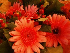
P3250370BlogOrange

About Orange

The colour orange radiates warmth and happiness. In the world around us it’s the colour of vivid sunsets, fire, flowers, vegetables and many fruits. It’s the colour of Halloween, pumpkins, and marmalade, it is also the colour of festivity and amusement.

Orange means energy, vitality, excitement, activity, adventure, and risk.

Orange is associated with vitamin C and good health. Orange is symbolic of the Fall season. The colour Orange is associated with Protestantism.

Orange as a flourescent colour is used for high visibility. It is worn as vests for construction workers, cyclists, city traffic site workers and police officers. Orange cones are used as construction zone marking and safety equipment.  Orange is the colour of school buses.

It is a popular colour for sports teams because of its high visibility and association with activity.

There are a broad spectrum of orange tints and shades like terracotta, cinnamon, melon, peach, salmon, and burnt sienna.

Orange in Different Cultures

  • Because of its symbolic meaning as the colour of activity, orange is often used as the colour of political and social movement. Orange is the party colour for too many countries to mention.
  • This colour as mentioned above is a popular colour for sports teams.
  • Western Culture: Orange is a theme color for Halloween, halloween jack-o-lanterns, halloween decorations, and pumpkins.  This makes sense because it is the color associated with autumn and harvest.
  • The Dutch national sports teams, Australian Football League, Indian Premier League, Ukrainian Premier League, Bulgarian A Professional Football Group, Gaelic Athletic Association, United Football League, Philippine Basketball Association, Scottish Premier League, Norwegian Premier League and the Canadian Football League. [information from https://en.wikipedia.org/wiki/Orange_(colour)]
  • India: Orange is incorporated in the flag of India
  • Niger: Orange is on the Flag of Niger representing the Sahara desert and the orange disk symbolizes either the sun or independence.
  • United Kingdom: orange stands for the Northern Irish Protestants. Orange is on the flag of Ireland.
  • Netherlands: The Royal family of the Netherlands belongs to the House of orange. It is the national colour of the Netherlands.
  • In Asia: it is the symbolic and sacred colour of Buddhism – illumination, the highest state of perfection. The saffron colours of robes to be worn by monks. This colour is also symbolic and a sacred colour of Hinduism.
  • China: In ancient China, orange represented transformation.

Theory of Orange

  • Orange is a secondary colour located midway between the primaries yellow and Red on the colour wheel. It’s character of expression changes depending on the ratio of these primaries in the mixture. This ratio will reflect its colour temperature. More yellow makes the orange lighter and more red makes orange darker.
  • Orange became a important colour for all the impressionist painters. They understood colour theory, and they knew that orange placed next to it’s complement blue made both colours brighter as seen in the painting Sunrise by Claude Monet and Pierre-Auguste Renoir’s painting Oarsmen at Chatou.
  • Paul Gauguin used orange paint as backgrounds, for clothing and skin colour, to fill his paintings with light and exoticism.
  • Henri de Toulouse-Lautrec was very fond of orange, the colour of amusement.
  • Claude Monet painted a series of haystacks with the colour orange.

Things Orange

  • Fruit: Apricots, Butternut squash, Cantaloupe, Cape Gooseberries, Carrots, Golden kiwifruit, Grapefruit, Mangoes, Nectarines, Oranges, Papayas, Peaches, Persimmons, Pineapples, Pumpkins, Rutabagas, Sweet corn, Tangerines.
  • Vegetables: Orange bell pepper, butternut squash, yams, carrots.
  • Flowers: California poppy, flowering maple, pot marigold, Asiatic lily, butterfly wee, Asiatic lily, ‘Klondike’ cosmos, Iceland poppy, helenium, lantana, fritillaria.
  • Gemstones: Garnet, Mexican fire opal, orange beryl, orange tourmaline, Malaya garnet, Orange sapphire, poppy topaz, mandarin garnet, Mexican jelly opal, orange diamond, orange sunstone, orange zircon, citrine, orange amber, peach moonstone, sardonyx, orange agate, Picasso marble, peach aventurine, palm wood, orange fluorite, orange beryl.
  • Animals: Lions, tigers, orangutans, red river hogs, fire fox, gila monster, dart frog, orange Julius butterflies, monarch butterflies, goldfish, Irish setter.
  • Other: Garfield comic strips, cheese, a lion’s blaze, Cheetos, Doritos, traffic cones, orange soda, pennies, loonies, Vitamin C, life vests, the gates at Central Park, Ernie from The Muppets, Home Depot Logo, Kraft macaroni & cheese, The Golden Gate Bridge, Beeker the Muppet, nail polish, lipstick, basketballs, campfires and sunsets.


Stay connected for future posts about colour.  My website: www.donnawilsonartist.com

post

About Colour: Violet

ABOUT COLOUR: VIOLET

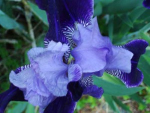
DSC01525IrisBlog

About Violet

Red-violet connotes spiritual love. In purple (reddish violet), the colour of the cardinals, temporal and spiritual power is united. As the opposite of yellow, consciousness, violet represents unconscious – mysterious, impressive, and sometimes oppressive, now menacing, now encouraging, according to contrast. When violet covers large regions it can be frightening.  Primarily, all tints represent the brighter qualities of life, whereas shades symbolize the dark and negative forces.

In nature many plants have light violet shoots with yellow centres.

Many of our fruits, vegetables, gemstones and minerals are violet such as eggplants, beets, purple cabbage, grapes, lilacs, irises, lavender, and amethyst mineral, purple garnet, sapphire, opal and topaz.

Violet is the hue synonymous with devotion, piousness, religion, holiness, saintliness, reverence, justice, sensuality, shadows, solitude, splendor, truth, superstition, majesty, and magic. In the other side of the coin violet represents arrogance, exaggeration, dishonesty, sorrow and secrecy.

Violet in Different Cultures

  • In Europe: Red-violet has been the colour most associated with royalty. It is still used by the British Royal Family and other royalty in Europe as a ceremonial colour on special occasions.
  • Britain: Red-violet (purple) is sometimes associated with mourning.
  • China: Red-violet represents spiritual awareness, physical and mental healing, strength and abundance. It also symbolizes luck and fame. It represents nobility. In Chinese painting, this colour represents the harmony of the universe.
  • Japan: Red-violet represents privilege and wealth, the colour associated with the Japanese aristocracy.
  • India: Reincarnation.
  • Thailand: Widows in mourning wear violet.
  • Brazil: Purple is the colour of mourning.
  • Egypt: The colour purple is the colour of virtue.
  • Catholicism: Contrition, penitence, colour of Lent

The Theory of Violet

  • Violet is a secondary colour located midway on the colour wheel between the primaries red and blue.
  • Violet is opposite yellow on the the colour wheel.
  • It is also sandwiched between blue-violet and red-violet.
  • It’s character of expression changes depending on the ratio of these primaries in the mixture. This ratio will reflect its colour temperature.
  • The range of modulation is very broad as violet is the darkest hue on the colour wheel. Add white to violet and this hue will extend to a wide range of tints and values. Add black to violet for a wide range of violet shades.
  • Add violet’s complement, yellow, and you will get various transitional tones between light yellow and dark violet.
  • Cobalt violet was used by artists Paul Signac, Claude Monet and Georges Seurat. Vincent van Gogh was very knowledgeable on colour theory and he used violet in many of his paintings including his paintings of irises and the swirling and mysterious skies of his starry night paintings. He often combined it with it’s complementary colour, yellow.

Do check out my website at www.donnawilsonartist.com

(https://en.wikipedia.org/wiki/Purple).

post

About Colour: Yellow

ABOUT COLOUR: YELLOW

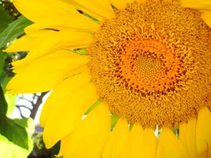
DSC02835wSF

About Yellow

Yellow is the most luminous and lightest of hues. It loses this light-giving quality as soon as you add black or gray or violet. When black is added it becomes like a sap green. Yellow is the one hue that rapidly changes its character when mixed with another colour.  This hue represents happiness, optimism, the sun and light. Paintings of the early masters symbolized heavenly light using a golden yellow.   When a person is smiling, he/she is glowing from the inside out.

In everyday language, to say “ a light bulb went on” or to say “to see the light” meant the realization of an unsolved problem. The hidden truth was uncovered. To say that a person is bright is to say that he/she is intelligent. Therefore, yellow symbolizes knowledge and understanding. When yellow is altered it opposed understanding and becomes expressions of betrayal, envy, distrust, and doubt.

The colour yellow is everywhere in nature. It is the colour of sunflowers, tulips, daffodils, bananas, lemons, budgies, cockatiels, canaries and parrots. It’s the colour of Springtime. Yellow alerts us of danger. It is the caution light on our traffic lights.

Yellow in Different Cultures

  • In Western culture yellow is a sign of cowardliness and treason.
  • In Chinese culture yellow corresponds to the earth. It represents good luck. Yellow is considered the most beautiful and esteemed hues. This colour often decorates royal places, altars and temples. It was the colour worn by their emperors.
  • In Japan, yellow represents heroism.
  • In Mexico, the marigolds are an important Day of the Dead symbol.
  • The American Indians wore face paints and one of their favourite colours was yellow considered the sun’s colour, the setting sun, symbolic of beauty, sincerity, and peace. During the puberty ceremonial, an apaches ritual, the girl’s dress was dyed yellow, the colour of pollen, which in itself represents fertility (from the book, “Indian Dances of North America” on page 130, Chapter 9, Reginald and Gladys Laubin).

The Theory of Yellow

  • Yellow is one of the three primary colours. It is a warm colour located on the warm half of the colour wheel. It is situated at the top of the wheel with its complementary colour, violet, directly below. It is sandwiched between Yellow-orange and Yellow-green. In its purity it is the most luminous and lightest of all the hues.
  • Yellow loses it’s light-giving quality as soon as you add black or gray or violet. When black is added it becomes like a sap green. Yellow is the one hue that rapidly changes its character when mixed with another colour.
  • When yellow is surrounded by orange it blends optically to appear like a light orange. When yellow is surrounded by black and other dark tones, it becomes more radiant, strong, aggressive and energetic. On the other side of the scale, when yellow is surrounded by white it becomes subdued and subservient.
  • HANSA YELLOW LIGHT: is a yellow-green as it has some blue added.  It is considered to be a cool yellow compared to a yellow-orange.
  • CADMIUM YELLOW: is a yellow-orange as it has a red bias

A Poem About Yellow

“What is Yellow?”

Yellow is a sunflower,
A banana,
A feather from
A songbird,
The sun,
The brightest colour
Of all colours.
Yellow is a happy face
That glows from inside out.
Yellow is a buttercup
With petals to say he loves me
And he loves me not.
Yellow is yummy like lemon meringue pie.
Yellow is a butterfly,
A bumblebee flying high.

Author: Donna Wilson

Keep connected to check out future posts on “Colour”.  Check out my website at www.donnawilsonartist.com

post

About Colour: Blue

ABOUT COLOUR: BLUE


P8120073w

About Blue

How does the colour blue affect you? Does it make you feel happy or sad? Many people believe that colours have a psychological association.

Blue is abundant in nature. Look up to the sky and you may find a pale blue of daytime or a rich dark blue-black of evening. Look at the ocean or the sea and you will find various colours of blue depending on the season, time of day and where in the world you are viewing it.   If you are viewing a calm body of water you will associate calmness and serenity with the colour blue. It is very soothing and enduring.  When the sky becomes stormy and the waters wild blue will hold feelings of energy, strength and spirit. If it is winter and you are in Canada you will associate blue with coldness.  Blue represents wisdom, infinity, depth, nobility, and spirituality. Blue is associated with the nervous system. Blue is shadowy.   In the Catholic religion the Virgin Mary wears blue, a blue and white gown and a blue veil often encountered in paintings of the Annunciation. Blue represents profound faith. A blue sun filled sky has an active and vitalizing effect while the mood of the blue moonlit sky is passive and elicits nostalgias.

Blue in Different Cultures

  • In Western Culture blue is embraced as the colour of heaven. It is used in corporate identity. Several banks use this colour as in their logo. It represents trust and authority. Blue is embraced as the colour of heaven. The police were blue. A dark blue suit is professional business attire. Blue can also be very casual as in blue jeans (worn around the world).
  • In Eastern and Asian Cultures blue corresponds to immortality, wealth and self-cultivation.  In China blue is a feminine colour unlike in Western cultures. In Korea dark blue is the colour of mourning.
  • In Iran blue is associated with death. It is the colour of heaven and spirituality.
  • In Indian culture blue is the colour of Krishna – a central figure in Hinduism and Hindu gods. The colour blue represents strength in a lot of indian sports teams.
  • In Japan children visually represent the sun as a big red circle.
  • If we research the meaning of colours and their importance to Native American Indians we would find that each colour holds a special sacred meaning and symbolism. This is according to the beliefs of the tribe and their purpose. The colour blue used for face paint would mean something different than that used for war paint. Blue symbolizes wisdom and confidence. It also represented the sky, lakes, rivers and water. The Navajo tribe consider the colour blue important as it represents one of four sacred mountains. In certain Native cultures, blue can represent cleansing waters, peace, or sometimes winter and renewal.

The Theory of Blue

  • Blue is a primary colour. No two colours can create blue. Blue is considered a cool colour as it is located on the cool half of the colour wheel along with green. Here blue is sandwiched between blue-green and blue-violet.
  • When blue is surrounded by yellow it has a very dark effect lacking in radiance.
  • When blue is surrounded by black, blue will gleam in bright, pure strength (from Itten, the elements of color).
  • When blue is surrounded by a dull orange, like burnt sienna or burnt umber, the blue gets excited and the dull orange/brown awakens.
  • Blue surround by red-orange becomes luminous.
  • MANGANESE: is a blue-green so is Cyan and Cerulean Blue. These colours contain some yellow making the blue greenish. They are considered cool.
  • ULTRAMARINE: is a blue containing some red. Therefore, this blue leans towards warm.

A Poem – About Blue

“What is Blue?”

Blue is the sky that envelopes me,
Blue is the water that is wild and free,
Blue lyrics share feelings that rest inside
Blue is a tradition with a bride.

Blue is the water I drink everyday.
Blue is not to be seen on my fish filet.
Blue is fruit delicious and sweet
Blue is powerful and on wallstreet.

Blue is one of three primary colours.
Blue can be mixed to make others.
Blue is seen in green and violet.
Blue cannot be seen in scarlet.

Author: Donna Wilson

Check out Donna’s website at www.donnawilsonartist.com


post

About Colour: Red

ABOUT COLOUR: RED


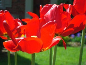
DSC01340w1 

About Red

Red is one of the three primary colours. It is located on the warm half of the colour wheel. It’s one of the colours that we see when we look at a flame. A fire truck is red. What a coincidence! Red excites the emotions which motivates us to take action. It is stimulating and lively. Red is associated with passion, seduction and lust. Is it any coincidence that the retail fashion stores fill their shops with red lingerie prior to Valentines Day or that Cupid is red?   Red is also associated with blood, danger, anger, aggression and war. When a person is angry their face appears reddish when it flushes with blood. Red is also associated with evil. The devil is usually represented with red skin. Red is the universal colour for stop and danger. Red triggers alertness and captures our attention. This is why we have red traffic lights, stop signs and red brake lights. Red also symbolizes strength, speed, determination, courage and socialism.  Red and pink (red plus white) is associated with “causes” like the awareness of breast cancer, AIDS and heart disease.

Red in Different Cultures

  • In Eastern culture such as China red corresponds to good fortune and joy.   Red is found everywhere during Chinese New Year.
  • In Indian culture it symbolizes purity, fertility, love, beauty, wealth, opulence and power.
  • In Japan children visually represent the sun as a big red circle.
  • If we research the meaning of colours and their importance to Native American Indians we would find that each colour holds a special sacred meaning and symbolism. This is according to the beliefs of the tribe and their purpose. The colour red used for face paint would mean something different than that used for war paint.
  • In South Africa red is the colour of mourning.

The Theory of Red

  • SCARLET: contains yellow making it a red-orange.   It is considered a warm red as opposed to a cool red which has blue in it. On the colour wheel it is considered an intermediate colour or tertiary color.   It is one of six of the tertiaries located on the colour wheel sandwiched between Orange and Red.
  • CRIMSON: contains blue making it a bluish red. It is also referred to as a cool red. Even through reds are warm there colour temperature is relative to each other.

There are many variations of red depending on how warm or how cool the red is and what pigments were used to create the colour. There are few true reds meaning neither leaning towards warm or cool. Having said this don’t get confused because red is located on the warm side of the colour wheel.

Things Red

  • Fruit: Cherries, strawberries, red delicious apples, cranberries, red pears, red grapes, pomegranates, rhubarb
  • Vegetables: Red peppers, tomatoes, chili peppers, ketchup, beets, red potatoes, radishes
  • Candy: Red smarties candy, candy canes, jelly beans
  • Gems: Ruby, garnet, topaz, fire opal
  • Flowers: Roses, tulips, geraniums, petunias, impatiens, poppies
  • Animals: Red fox, red tabby cat, Irish Setter, Scottish deerhound, red crested cardinal, red panda, red squirrel, red kangaroo
  • Other: fire, flame, nail polish, lipstick, lips, flags, cars, London telephone booth, London buses, Rudolph’s red nose, Santa Claus, red hair, red crayon, paint, hearts, valentine cards, cupid, Valentine’s Day, lingerie, ladybugs, tongue, ribbon, fire extinguisher, traffic lights, ambulance, leaves, wine, stop signs, fire trucks, fire hydrants, the Boston Red Sox, red sea stars, red moon, red velvet, and a red brick house


Stay Connected: In future blogs I will post more ABOUT COLOUR!  Check out Donna’s website at www.donnawilsonartist.com


error: Content is protected !!